They say don’t judge a book by its cover, but every week I take a stroll around the local bookstore and wonder. . . what were they thinking?
Romeo & Juliet by William Shakespeare

I find these revamped (get it ?) to look like Twilight covers to be odd. In case the cover wasn’t enough to hide that this is a play from the 16th century, the first few pages are an abridged version written in first-person. You know, in the off chance someone reads a few pages in the bookstore. What is even funnier is that this is in the Teen section of the bookstore… .right next to the paranormal romance.
The about the author page claims that Shakespeare “would think this version of his play is awesome.” The bard invented a lot of words, but I’m sure awesome wasn’t one of them
Not Afraid of Life: My Journey So Far by Bristol Palin

Was this cover made in MS paint ? Why did they use white Arial font? Do they know you can hardly read the pink text at the bottom? This cover is terrible, the spacing is odd and not helped by how the text is two different sizes. Furthermore, the book title has a colon in it, why is there no colon on the front cover? It just looks lazy– come on HarperCollins !
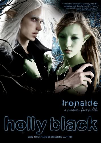
Ironside by Holly Black

This book like it’s predecessor, Tithe, has a few different covers but the one I keep coming across looks like a bad Photoshop job. Once again I don’t get the proximity going on here with the fonts. Where did they get that stock photo from, DeviantArt ? Also notice on Black’s website it’s spelled Faery’s Tale, but on the cover, it is spelled Faerie.

1/2 of the blogging duo at Books and Sensibility, I have been blogging about and reviewing books since 2011. I read any and every genre, here on the blog I mostly review Fantasy, Adult Fiction, and Young Adult with a focus on audiobooks.