First released in 2007, City of Bones by Cassandra Clare holds a special place here at Books and Sensibility as the first book we ever reviewed.
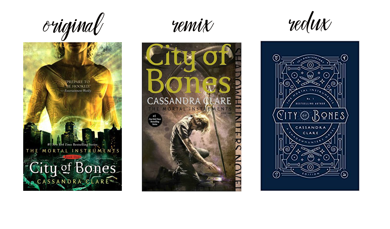
10 years later, this book has spun off to include–and I’m just estimating here– a floppity-jillion books, short stories, graphic novels and novellas; a TV show and one terrible movie I saw see in an empty theater on opening weekend. To celebrate the 10 year anniversary Simon and Schuster released a new cover for City of Bones. Let’s take a look:

The Orignal
The original cover is the classic. Go to any used bookstore and 9 times out of 10 you will find the paperback version of this cover. This cover is one of the very few YAs to have a naked chest, in fact I can only think one other YA book (Altered by Jennifer Rush, but they covered it up on the paperback) that did this and while I get it’s supposed to show the runes it’s just….a weird choice for YA.
The Remix
In 2015, the entire Mortal Instruments and Infernal Devices series had re-designed paperbacks with the characters in dynamic poses. I really like these covers, they just scream urban fantasy. I also love a good stepback.
The Redux
Now both the 2007 and 2015 cover look way cooler in person because they’re shiny and textured. I haven’t seen this new cover in person but from the pictures I’ve seeen it’s kind of …meh. As much as I love simple covers, this new doesn’t tell me much and if I didn’t know what this was I don’t think I’d pick it up.

I’m a lifelong reader who started blogging about YA books in 2011 but now I read in just about every genre! I love YA coming of age stories, compelling memoirs and genre bending SFF. You can find me talking all things romance at Romance and Sensibility.